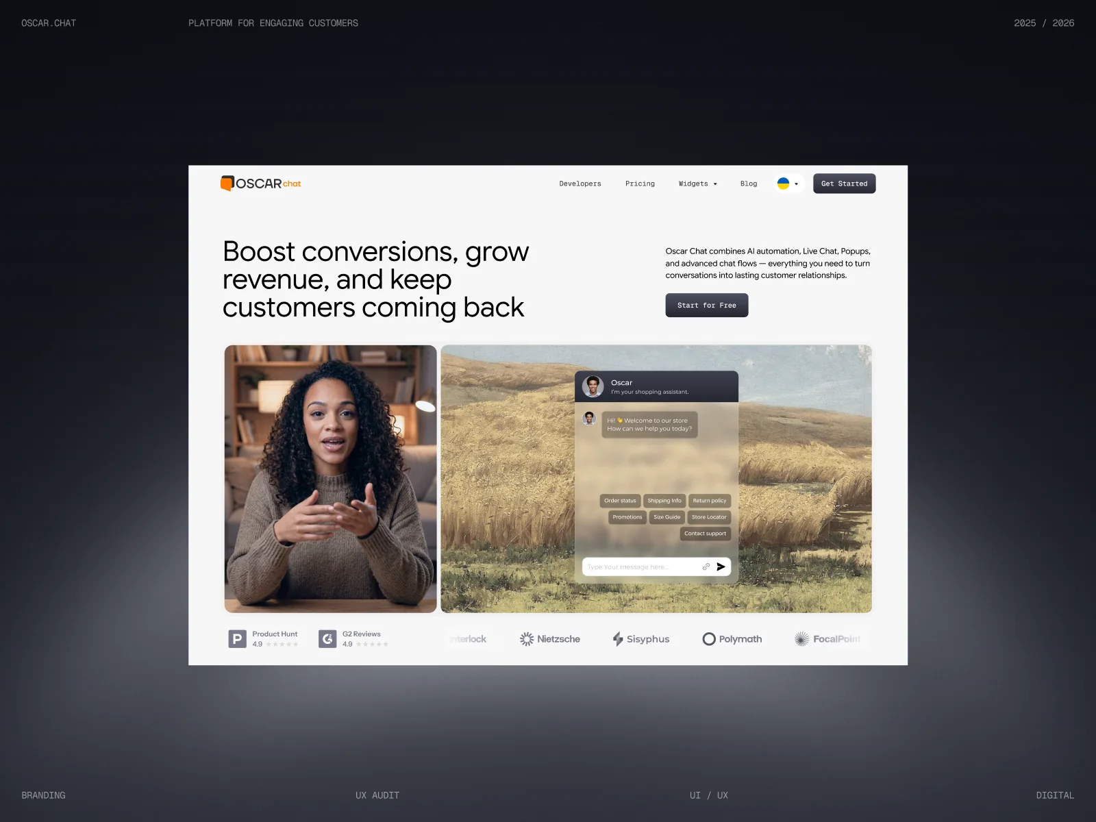
Key takeaway: Oscar Chat had a strong product and a fragmented face. Different designers had built different parts of the app, and the website didn't explain what the product did. We built one design system for the whole app, rebuilt the site around a clear first screen, and gave the team a content system for launches, awards and the Shopify App Store.
Oscar Chat is a customer engagement platform. AI chat, live chat, popups and contact buttons in one widget, so a business can catch visitors, capture leads and answer questions around the clock. It connects to the tools teams already use, from Shopify to Salesforce and Klaviyo.
The product worked. The way it looked and explained itself did not keep up.
Project snapshot
- Client: Oscar Chat, customer engagement and AI chat platform
- Starting point: No unified design system, a website that didn't explain the product
- Our scope: UX audit, design system, product UI, website, brand content, marketing, SEO and GEO
- Recognition: Bold Award TOP Finalist, Barcelona, March 2026
- Distribution: launch on the Shopify App Store
The problem: one product, many design languages
Oscar Chat grew fast, and different designers built different parts of the app over time. Each screen made sense on its own. Together they felt like several products stitched together, which made the app harder to learn and harder to extend.
The website had a separate problem. It didn't clearly say what the product actually did, so visitors couldn't grasp its value before they left.
1. A design system built from scratch
We started with the foundations: colors, typography, icons and the core UI components. Then we used them to bring every part of the app under one logic.
- One pattern for every widget. AI chat, live chat, popups and buttons are configured the same way, so a user who learns one learns them all.
- A type pair that does the work. Google Sans Flex for headings and body, Geist Mono for buttons, labels and small UI text.
- Built to scale. New features drop into existing components instead of getting a new look each time.


2. A website that explains the product in one screen
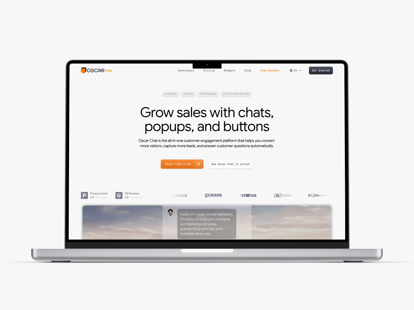
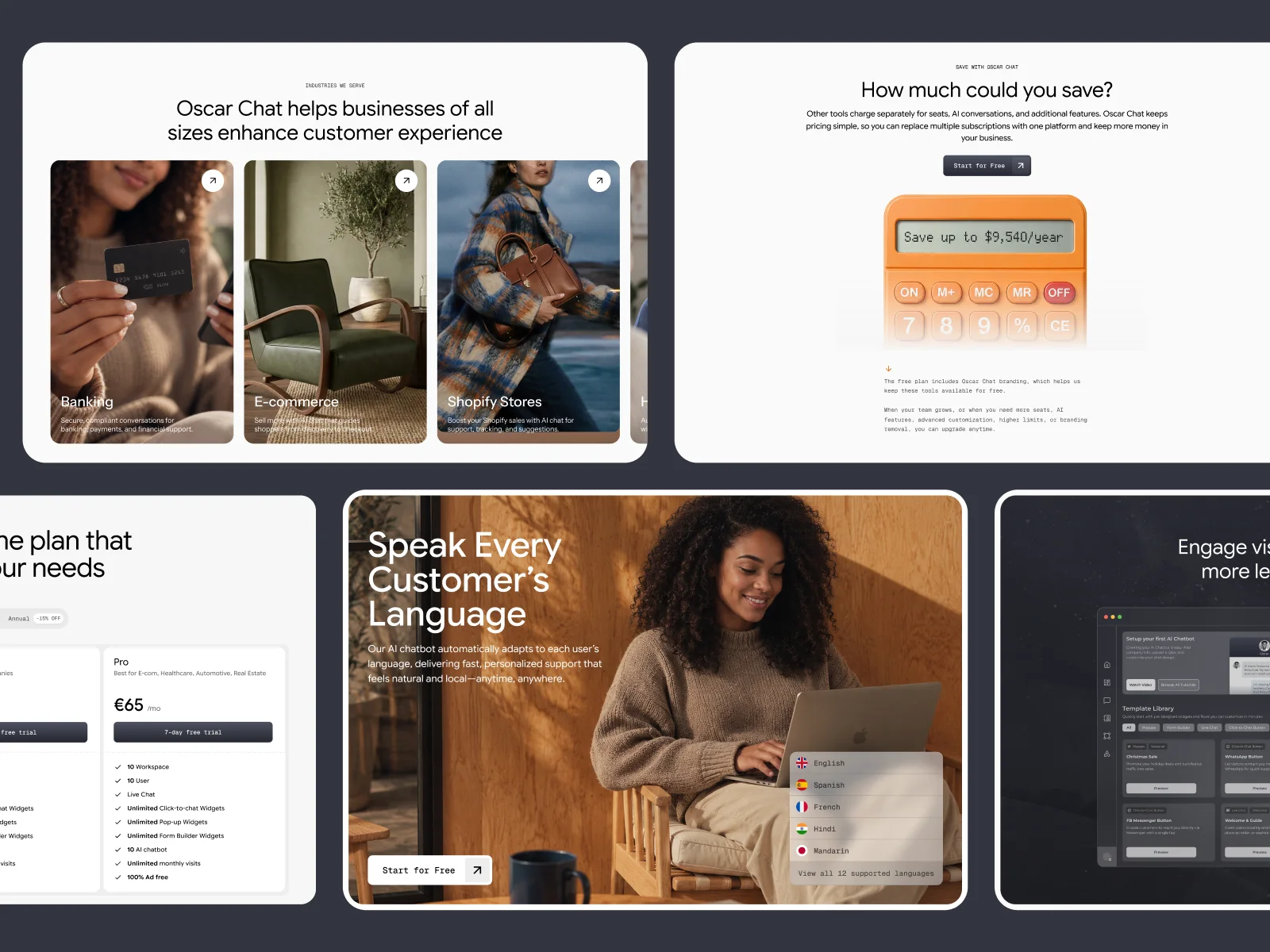
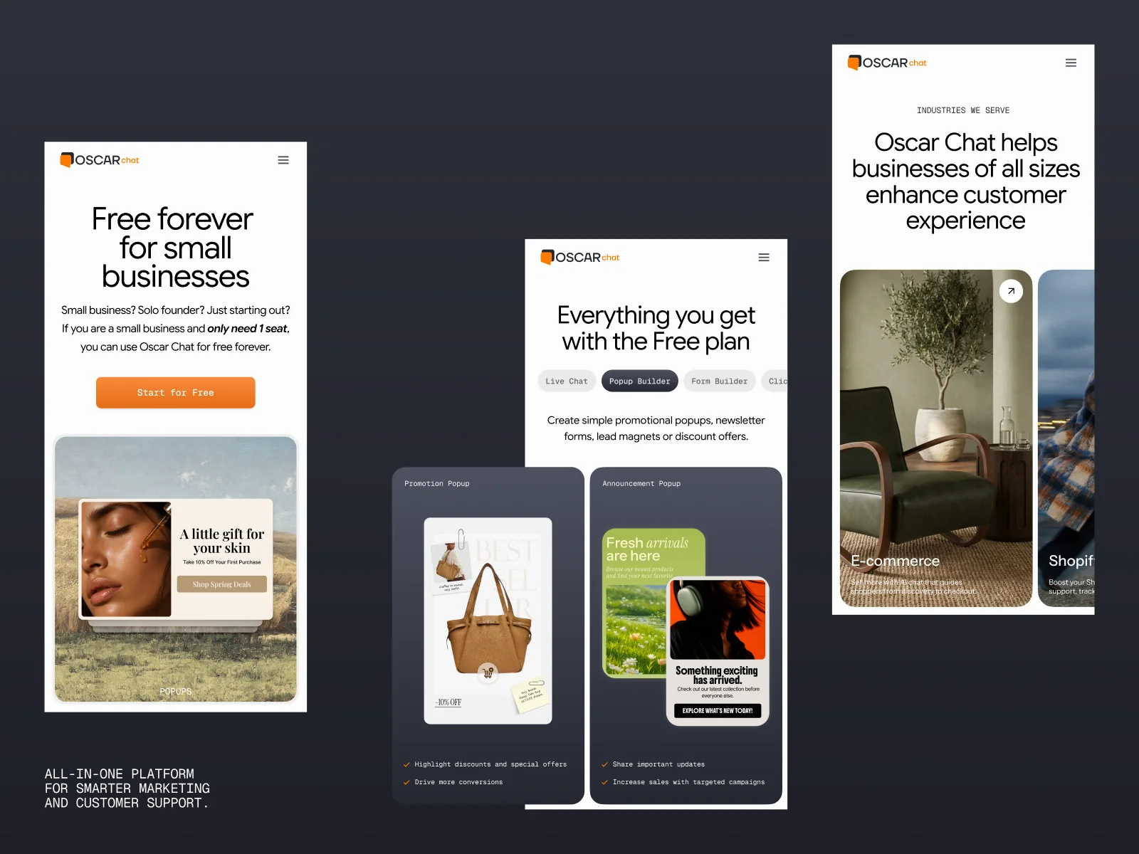
For the site, the job was clarity. A visitor should understand what Oscar Chat does from the first screen, before any scrolling. We kept the existing brand colors and logo, so current customers still recognized the product they trust.
- A first screen that names the outcome: more conversions, more revenue, customers who come back.
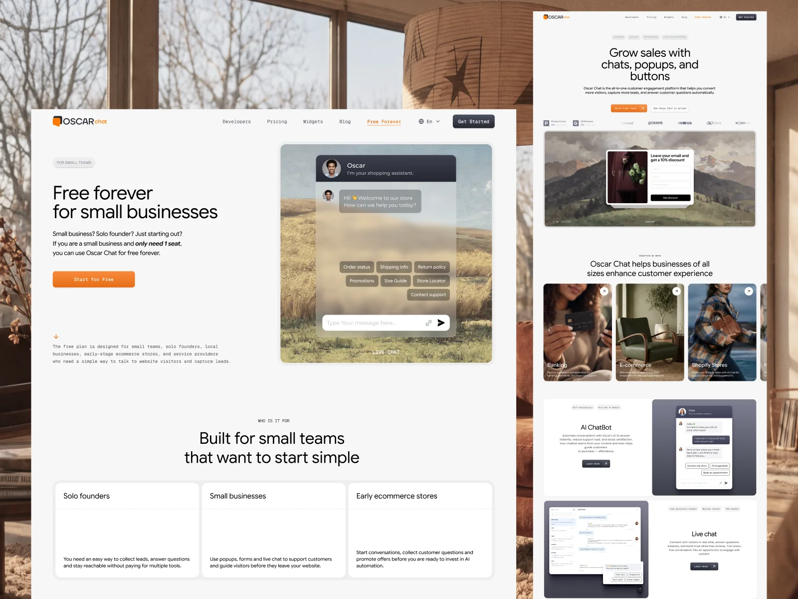
- Product sections that show each widget in use instead of describing it.
- A savings calculator that compares one platform with several separate tools.
- Industry pages for banking, e-commerce and Shopify stores.
- Clear plans, starting with a free one.
Does your product look as good as it works?
We build design systems, websites and launch content for product companies, so the product is easy to understand and easy to grow.
3. Content for launches, awards and the App Store
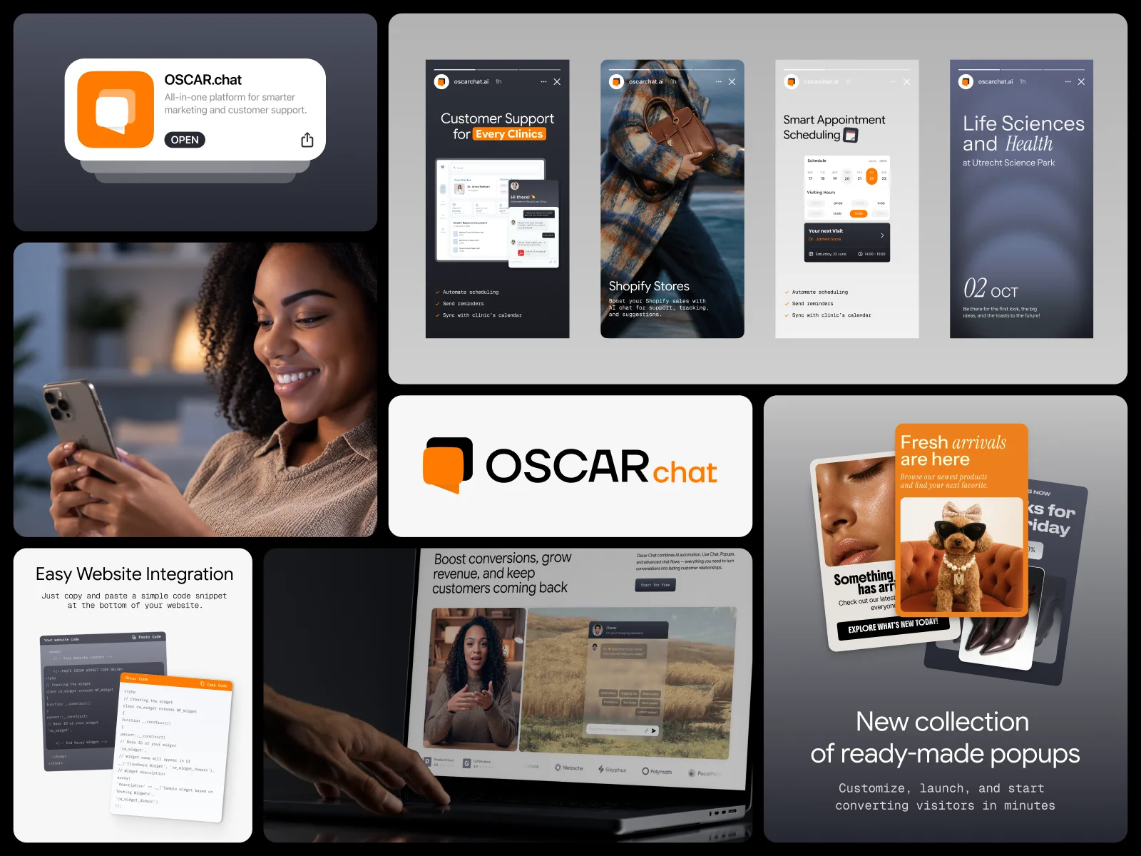
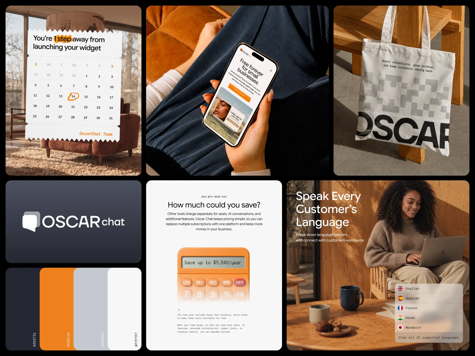
A growing product needs a steady flow of visuals: feature launches, social posts, ads, stories and announcements. We built a content system on top of the design system, so every new piece looks like Oscar Chat without starting from zero.
- Social banners and ads for each widget and use case.
- Stories for launches and the Bold Award, where Oscar Chat was a TOP Finalist in Barcelona in March 2026.
- Launch creatives for the Shopify App Store.
- Out-of-home and print mockups that keep the same visual language.



What the client said
"I'm happy to recommend the Cinnaboner team. They've helped design and shape several products for me, including developing the brand and overall user experience. Their approach is collaborative, reliable, and focused on real results."
Jack Berube, CEO of Propper.ai
Results
- One design system across the whole app, with a single pattern for configuring any widget or feature.
- A website that explains the product from the first screen, without losing the brand customers already knew.
- A content system for launches, ads and announcements that the team can keep using.
- Bold Award TOP Finalist, Barcelona, March 2026, and a launch on the Shopify App Store.
What another product team can take from this
- Fix the system before the screens. A shared set of colors, type and components stops every new feature from drifting.
- Make one pattern do many jobs. If every widget is configured the same way, users learn once.
- Say what the product does on the first screen. A visitor who has to scroll to understand you usually doesn't.
- Keep what customers already trust. A clearer site doesn't need a new logo.
- Build content on the same system. Launch visuals are faster and more consistent when they reuse product components.
Before you ask
A UX audit, a design system built from scratch, product UI, a new website, brand content for social and launches, marketing support, and SEO and GEO.
No. We kept the existing brand colors and logo to preserve trust with current customers, and focused on the design system, the product and the website.
Without one, every designer and every new feature adds a slightly different look. A system keeps the product consistent, speeds up new features and makes the app easier to learn.
No. Most of our work today is for manufacturers of physical products, and the same approach, a clear system and a site that explains the product fast, applies there too.
Related reading
For a manufacturer brand built on the same thinking, read the OCParts case study. For the chatbot side, see AI chatbots for manufacturer websites.
Make your product easy to understand
Design systems, websites and launch content from one senior team, for a fraction of what an in-house team costs.