Key takeaway: The gap between a SaaS website that wins design awards and one that wins customers comes down to structure, clarity, and trust — not aesthetics.
Your SaaS website is beautiful. The typography is perfect. The color palette is sophisticated. The animations are smooth. It's winning design compliments.
But it's not winning customers.
This is the gap we see constantly in SaaS founder conversations. The website that looks polished on Dribbble is not the same as the website that turns browsers into trial signups. At Cinnaboner, we've designed product websites for fintech platforms, solar engineering tools, customer engagement SaaS, and ad tech — and the pattern is always the same: aesthetics and conversion are not the same thing.
The real question isn't "Is this design beautiful?" It's "Does this design move someone toward buying?"
The Beautiful Website Problem
Here's what happens. You hire an agency. They make something stunning. Lots of whitespace, a killer hero image, custom animations, a sophisticated color system. Investors love it. Design blogs want to feature it.
Then you launch. Traffic comes. But conversion doesn't move.
Why? Because beautiful and effective are orthogonal problems. A beautiful website can absolutely fail to communicate your value. A less polished website can convert like crazy if it's built around one thing: clarity about what your product does and who it's for.
Conversion-focused design starts with a different question. Not "What would look amazing?" but "What does this visitor need to see, right now, to move to the next step?" That's a design constraint that changes everything.
The difference shows up in specifics. Where you place the CTA. How many ideas compete for attention on the hero. Whether your pricing section actually explains what you charge for or just shows numbers. Whether your feature list helps someone understand your product or just says nice things about it.
Good design is invisible. It gets out of the way. It makes it easy to understand what you're selling. But "good" in this context means functional, not ornamental.
The Three Elements That Actually Move Conversions
If you stripped away everything from a SaaS website except the three things that statistically matter most, you'd have: clarity, trust, and friction reduction.
Clarity is where most SaaS sites fail first. The hero section tells visitors what you do. Not metaphorically. Not poetically. Actually. Within three seconds, someone landing on your site should know: what problem you solve and who it's for. Slack didn't become Slack because it had the most innovative hero copy. It became Slack because it said "Where work happens" and showed a screenshot. Crystal clear. Three seconds.
Many SaaS founders want their hero to be more sophisticated. Something that hints at their platform's depth. Something that makes prospects think. The data says this costs conversions. Visitors have 8–12 seconds of attention. If you spend them being clever, they leave without understanding your value.
Trust is built three ways on SaaS websites: social proof, transparent pricing, and showing your product. Most sites do one of these. The ones that convert do all three.
Social proof is straightforward — logos of companies using you, customer testimonials, numbers (X users, $X in funding, X% improvement). But it has to be real. Fake testimonials are obvious and backfire. Real testimonials that are specific (not generic praise) move the needle.
Transparent pricing matters more than you think. Many founders hide pricing behind "book a call." This kills conversion. Your ideal customers want to know what they'll pay before they talk to sales. Hiding it selects for price-insensitive buyers and filters out the rest.
Showing your product is underutilized. Most SaaS sites describe their features in prose. The ones that win show you actually using their software. A 30-second video of someone logging in and doing a task converts better than a paragraph explaining it.
Friction reduction is the third pillar. Every additional form field drops conversions. Every step in your checkout process loses people. Every second your site takes to load costs money — each additional second of load time drops conversions by 7 percent. On mobile (where 50%+ of your traffic is), anything over 3 seconds costs you visitors.
Friction also includes cognitive load. Too many CTAs on a page. Too many color calls-to-action competing for attention. Too many sections each saying something different. Pick one primary goal per page. One CTA. Everything else supports it.
Not sure where to start?
Tell us what you're building. We'll tell you what it needs.
The Difference Between Landing Pages and Product Websites
There's a category error many founders make. They design their main site like a landing page. Single CTA. Everything points to "sign up now."
But a SaaS website and a landing page have different jobs.
A landing page is a single conversion funnel. It's built around one goal: get someone to fill out a form or click "start free trial." Every element supports that. You're not trying to educate broadly. You're trying to move one type of person toward one action.
A product website is different. It's addressing multiple audiences at different stages. Some visitors are comparing five platforms and need to understand how you're different. Some have already decided and need pricing. Some are evaluating on behalf of a team and need a security data sheet. A single landing page structure fails these users.
The best SaaS sites handle this by creating multiple pathways. A founder sees a "for founders" section. A VP of sales sees "for enterprise." A technical user sees "API documentation." Same site, multiple entry points based on intent.
This is where information architecture matters. Most SaaS sites show everything to everyone. The winners show different things to different people.
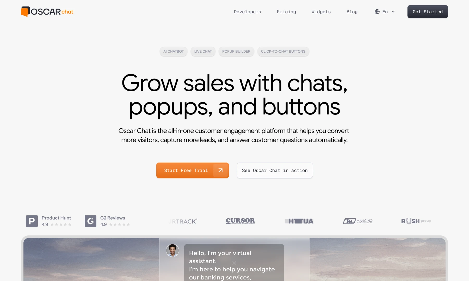
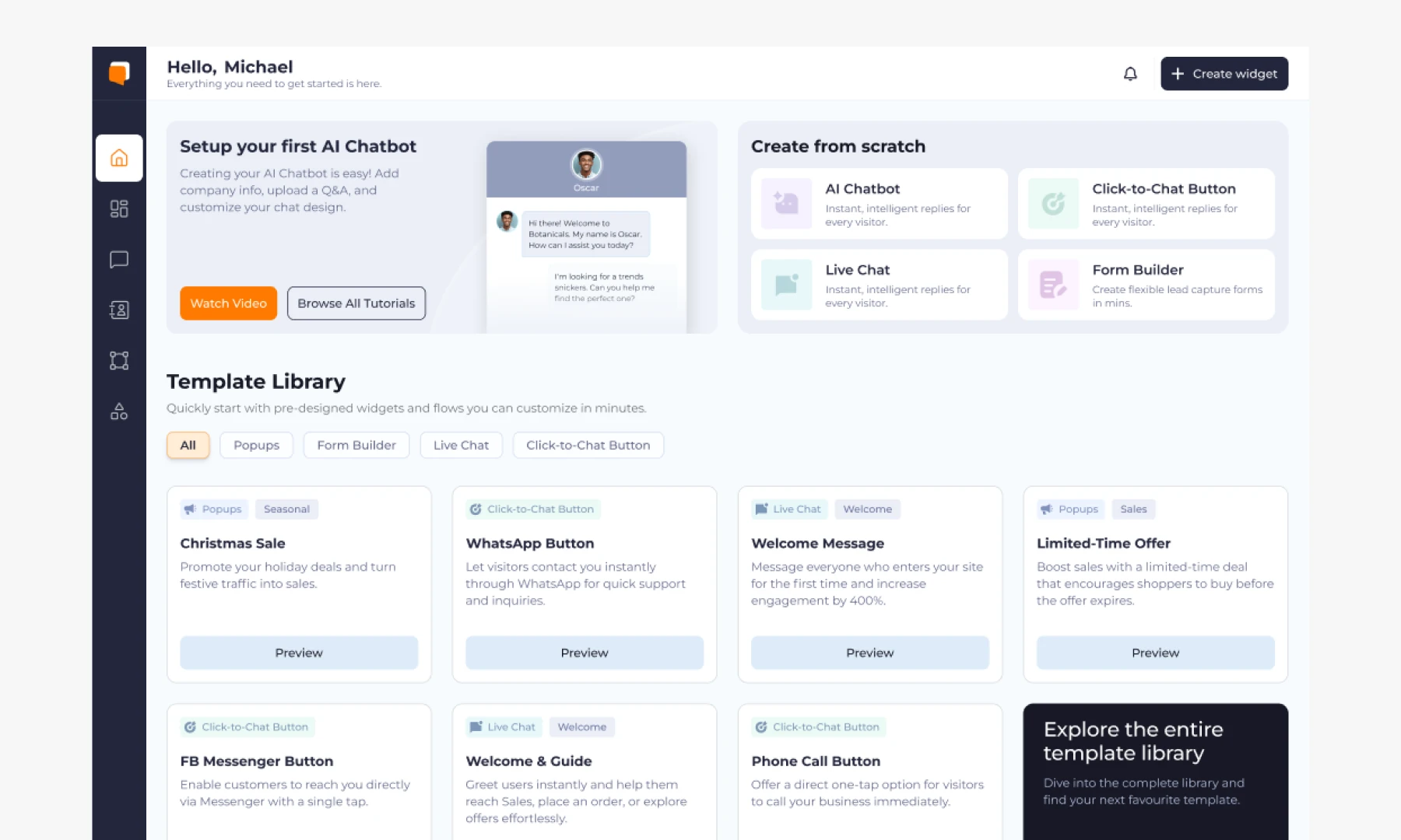
Real Example: Oscar Chat's Conversion-First Redesign
Oscar Chat is a customer engagement platform — live chat, popups, automated responses. When we took on the project, they had a clean site, but conversion was soft. Good traffic. Not enough signups.
We ran a UX audit. The problems were clear: the homepage tried to speak to three audiences simultaneously. Visitors didn't know if it was for e-commerce teams, SaaS companies, or service businesses. The features section was abstract. Pricing was buried. There was no clear reason to sign up now versus later.
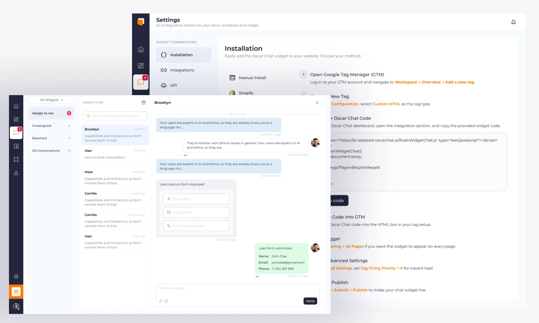
The redesign was less about making it more beautiful and more about restructuring the information. We created separate pathways for e-commerce vs. SaaS vs. service businesses. Added product videos showing actual workflows. Moved pricing to the main navigation. Changed the single CTA "See All Features" to multiple micro-conversions: "Start Free Trial," "See Pricing," "Watch a Demo."
Conversion went up 34 percent after the redesign. Not because it was more beautiful. Because it was more honest. It showed what the product actually does. It let different people find different answers.
The SaaS Design Checklist: Conversion Focus
If you're auditing your own SaaS website, here's what to check:
The three-second test: Can someone understand what you do in three seconds? Not what you're passionate about. What you sell. If they can't, your hero is too clever.
The mobile test: Don't just resize your browser. Pull out your phone. Try the signup flow. Count seconds to load. Is that CTA button easy to tap? If your mobile experience is worse, you're losing 50 percent of your conversions.
The product visibility test: Can someone actually see your product working? Not a screenshot. Not a feature list. An actual interface doing something. If this is missing, your site is describing a solution, not showing one.
The pricing clarity test: Can someone find your pricing without talking to your team? If pricing is missing or hidden, you're filtering for curiosity, not conversion.
Conversion Design is Design
The best SaaS websites are both beautiful and converting. It's just that beauty is in service of clarity and function, not the other way around.
When we design a SaaS website, we're not asking "What would look impressive?" We're asking "What does this person need to see to move forward?" The design serves that. If that means less animation, we use less animation. If it means showing the product instead of describing it, we show it.
This is what conversion-focused design actually means. Not compromise on quality. Quality in service of results.
Pull your analytics. Find your highest-traffic page. Note the conversion rate. Then ask: are visitors clear on what I do? Can they see my product working? Is pricing transparent? Are there too many competing CTAs?
If you can't answer those confidently, your site needs a strategy reset before the next design iteration. We've helped fintech, AI, solar engineering, and ad tech founders get this right. It's clarity + trust + friction reduction. Build those three things into your site, and the conversions follow.
Your product deserves a site that sells it.
If it won't, we'll be the first to tell you.