Key takeaway: Branding a physical product for e-commerce requires a full sequence — positioning, visual identity, packaging, storefront, and launch — because the brand is the first thing a buyer evaluates before they ever experience the product.
You've spent years perfecting the product. The pigment ratios, the consistency, the quality control. You know it's good — better than most of what's already on the shelf.
But shelf is exactly the problem. Getting a physical product from your factory to a buyer's hands requires something that has nothing to do with how good the product is: it requires a brand. A name, a visual identity, packaging that makes someone reach for it instead of the one next to it, and a digital presence that exists when a buyer searches for exactly what you make.
Most manufacturers are exceptional at production and invisible at branding. At Cinnaboner, we've worked with paint makers, paint manufacturers, and consumer goods producers — and the pattern is consistent. Great product. No brand. That's the gap we help close.
Step 1 — Know Who You're Selling To Before You Design Anything
The most common mistake manufacturers make when building a brand is starting with visuals. Logo first, strategy never. This produces a brand that looks finished but doesn't work — because it wasn't built around a specific buyer.
Before any design begins, answer three questions with specifics, not generalities.
Who buys this? Not "artists aged 20–45" — that's too broad to build from. "A self-taught artist in her thirties who researches pigment quality before buying, shops on Etsy and specialty art supply stores, and follows a few painters on Instagram whose work she trusts" is a person you can design for. You know what she responds to. You know what she's skeptical of.
Why would she choose yours over the one next to it? This is your real differentiator — not what the product does, but why it does it better or differently. High-pigment concentration. A manufacturing process refined over decades. Lightfastness ratings that hold up over years. Pick the truest and most compelling thing, because that's what the brand gets built around.
Where does she buy? Marketplace (Amazon, Etsy, Rozetka)? Your own website? Physical art supply retail? The answer changes everything about how you present the product. A marketplace listing competes differently than a D2C website. A product for physical retail needs different packaging logic than one shipped direct.
This research isn't a focus group. It's 10 conversations with real potential buyers and an honest look at what competitors are doing. Two weeks of work that shapes the next five years of brand investment.
Step 2 — Build the Visual Identity in the Right Order
Visual identity for a physical product has more layers than it does for a software company. You need something that works in packaging, on a website, in social content, on a warehouse label, and in a photo on a buyer's shelf that gets posted to Instagram.
Name and naming logic first. The name shapes everything. It needs to be pronounceable, memorable, available as a domain and trademark, and ideally meaningful in your market's language without being awkward in others. Don't rush this. Test it out loud with five people who've never heard it. If they can't spell it after hearing it once, that's a problem for SEO and word-of-mouth.
Brand positioning statement second. One sentence. What you make, who it's for, and what makes it different. Not for the website — for internal clarity. Every design decision should trace back to this sentence.
Visual system third. Color palette, typography, logo, brand mark. These should reflect the positioning, not just current design trends. A premium art paint brand looks different from a household cleaner brand — not because one is more beautiful, but because the buyer expects different visual signals. Premium expects restraint, clean lines, considered typography. Value products expect clarity, boldness, legibility at shelf distance.
Application rules last. How does the logo sit on dark packaging? On light? What's the minimum size it can be used at? What colors appear together and which never do? This is what makes your brand look consistent when it goes from the designer's hands to a printer's hands to a photographer's hands.
Step 3 — Package It to Sell, Not Just to Ship
Packaging is the most underestimated part of physical product branding. Most manufacturers think about it last, when it should be thought about second — right after positioning.
Your packaging is your advertisement at the point of purchase. Whether that purchase is happening on a shelf or on a product page in a browser, the package is what the buyer evaluates in the 3–5 seconds before they decide.
Shelf presence. Does it stand out from adjacent products or blend into them? A clean, white premium design stands out on a shelf full of saturated-color competitors. A bold, colorful design stands out among minimal ones. The goal is differentiation, not decoration.
Information hierarchy. The buyer's eye moves in a specific order. Brand name, product name, key benefit, then supporting information. If the ingredients list is more prominent than the brand name, the hierarchy is wrong. If the "how to use" section competes visually with the benefit statement, buyers get confused and move on.
Print production readiness. Packaging design that isn't prepared for print production can't be manufactured. The right deliverable includes die-cut templates, bleeds, correct color profiles (CMYK for print, not RGB), and specs formatted for your specific packaging supplier.
Ready to take your product to market?
We bring together SKUs, production timelines, shelf requirements, and digital strategy — so you don't have to juggle three agencies.
Step 4 — Build the Digital Home
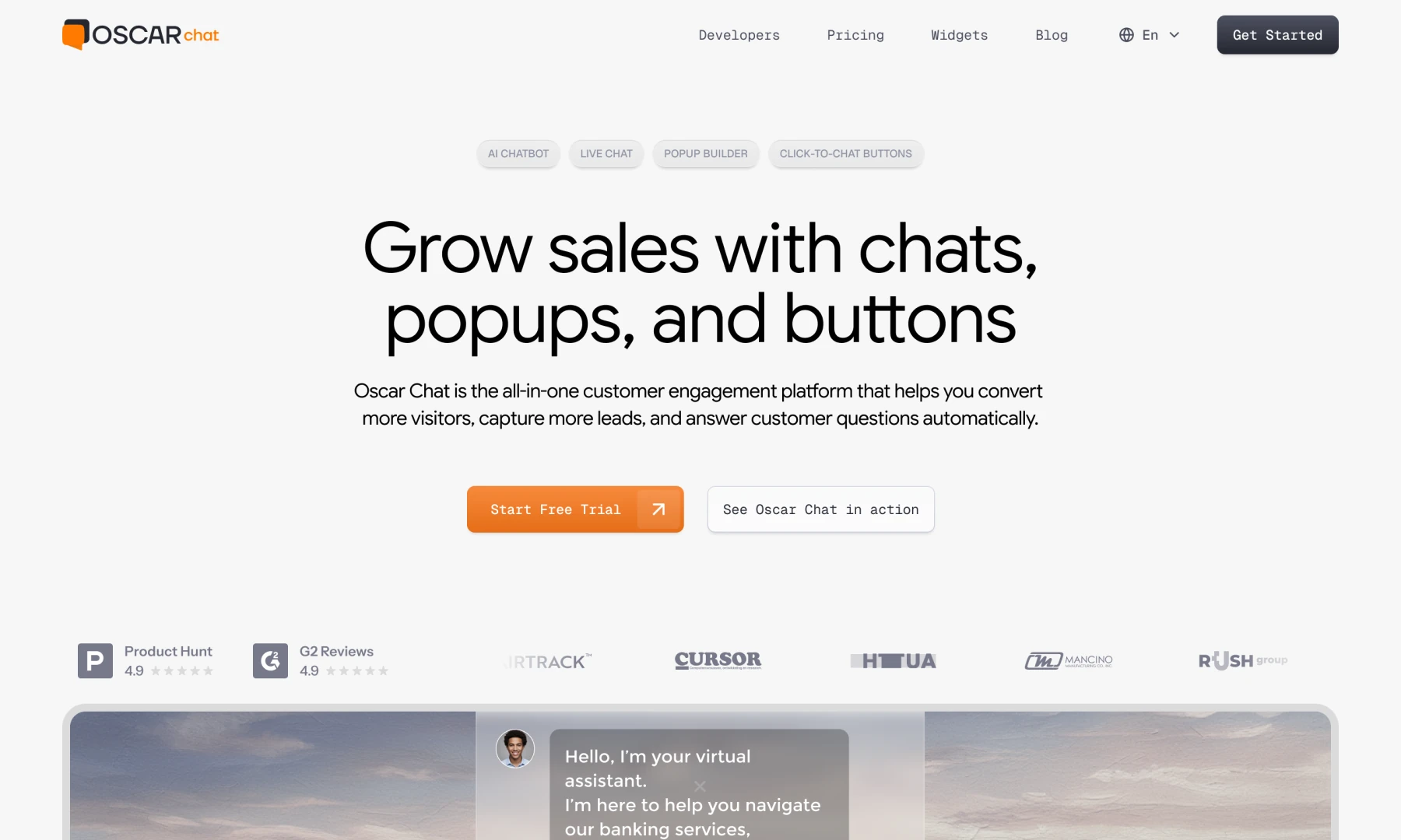
Every physical product brand needs a website. Not just because buyers Google products before they buy — though they do — but because a website is where you control the story. Marketplaces show your product next to competitors. Your own website shows only yours.
Show the product in context. Lifestyle photography matters more for physical products than for SaaS. A paint manufacturer's website needs to show rooms painted with the product, not just cans. An art paint brand needs to show the texture, the application, the result. Buyers need to visualize the product in their life before they buy it.
Make the buying process obvious. Whether you're directing buyers to your own shop, a retailer, or a marketplace listing, the path from "I want this" to "I bought this" should take three clicks or fewer.
Handle objections before they become reasons to leave. Pigment composition. Country of origin. Manufacturing standards. Lightfastness ratings. Return policy. Answer them on the product page, not buried in a FAQ.
Support SEO from the structure up. Product page URLs, category structure, image alt text, meta descriptions — built in from the start, they compound into free organic traffic over months and years.
Step 5 — Get Found Before the Competition Does
A branded product with a beautiful website that nobody finds is still invisible. Getting found means SEO built into your digital presence from day one — not added six months after launch.
For physical product manufacturers, the highest-value SEO targets are usually not the obvious category keywords. Everyone is fighting for "buy acrylic paint online." The buyers who are ready to purchase are searching for specifics: "heavy body acrylic paint for canvas," "lightfast acrylic paint professional grade," "interior paint that covers in one coat." These longer, more specific searches have lower competition and much higher conversion rates.
GEO (Generative Engine Optimization) is becoming increasingly relevant as buyers use AI tools to research purchases. Appearing in AI-generated answers requires structured, authoritative content about your product — pigment data, lightfastness ratings, technical specifications published clearly on your site.
What We've Seen Work: Barvita and Dnipro Contact
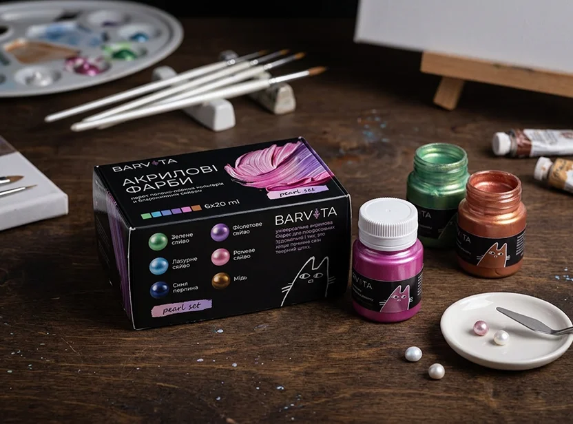
Barvita is an acrylic art paint brand we built from scratch. The founder had the pigment formulas, the manufacturing relationships, and the quality standards. What she didn't have was a brand that could sit credibly next to imported premium art paint on a buyer's shortlist.
We started with positioning research — who the buyer was, what she valued, what signals of premium quality looked like in her reference frame. The visual identity followed: a dark, restrained palette with refined typography. Packaging followed the identity. The digital presence followed the packaging. Each step built on the last.
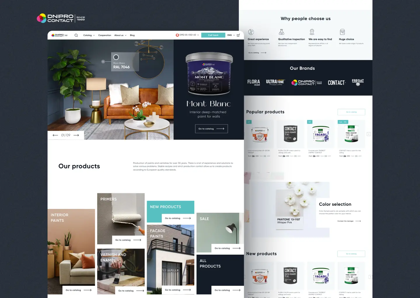
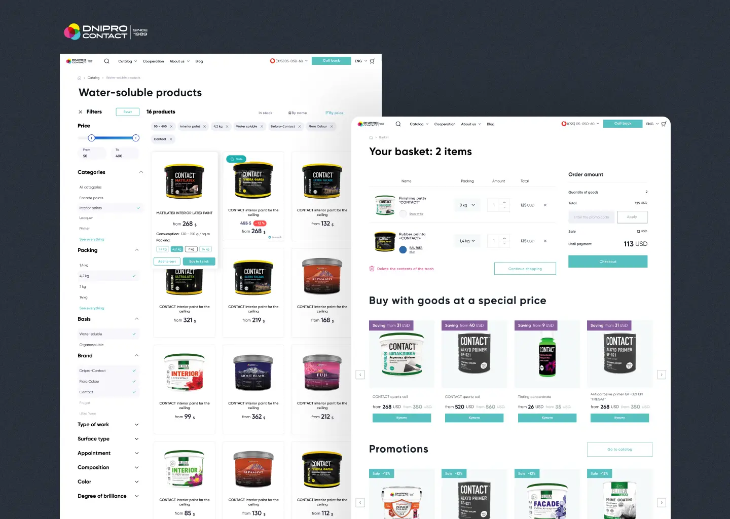
Dnipro Contact was a different challenge. A paint manufacturer since 1989 — established, trusted, with a loyal trade customer base — that needed to sell direct to consumers online for the first time. The work wasn't brand creation. It was brand translation: taking 35 years of earned expertise and making it navigable and trustworthy in a digital catalog that a homeowner could browse without needing a sales rep to explain it.
The Right Time to Start Is Before You Launch
Branding a product after it's already on the market is harder and more expensive than doing it before. A buyer who dismissed your product on their first encounter because the branding looked unfinished won't give it a second look.
The right time to invest in brand is before the first listing goes live. Before the first product photo is taken. Before the packaging goes to print. Everything downstream — the photography, the website, the social presence, the listing copy — is shaped by the brand foundation you build first.
You've put years into the product. The brand deserves the same investment. It's the part of the business that a buyer sees before they ever experience what you've made — and in e-commerce, it's often the only thing that gets them to try it at all.
If you're a manufacturer ready to take a product online and want to understand what that actually takes, that's exactly what we do for manufacturers.
We speak the language of makers.
You build the product. We make it ready to sell.