Key takeaway: A digital brand launch for manufacturers covers positioning, visual identity, packaging, website, and e-commerce in one coordinated build — because a great product without a coherent brand story is invisible online.
Dnipro Contact has been making paint in Ukraine since 1989. The chemistry works. The factory runs. Distributors trust the product. What the company didn't have, for the first thirty-five years of its existence, was a brand that told any of that story.
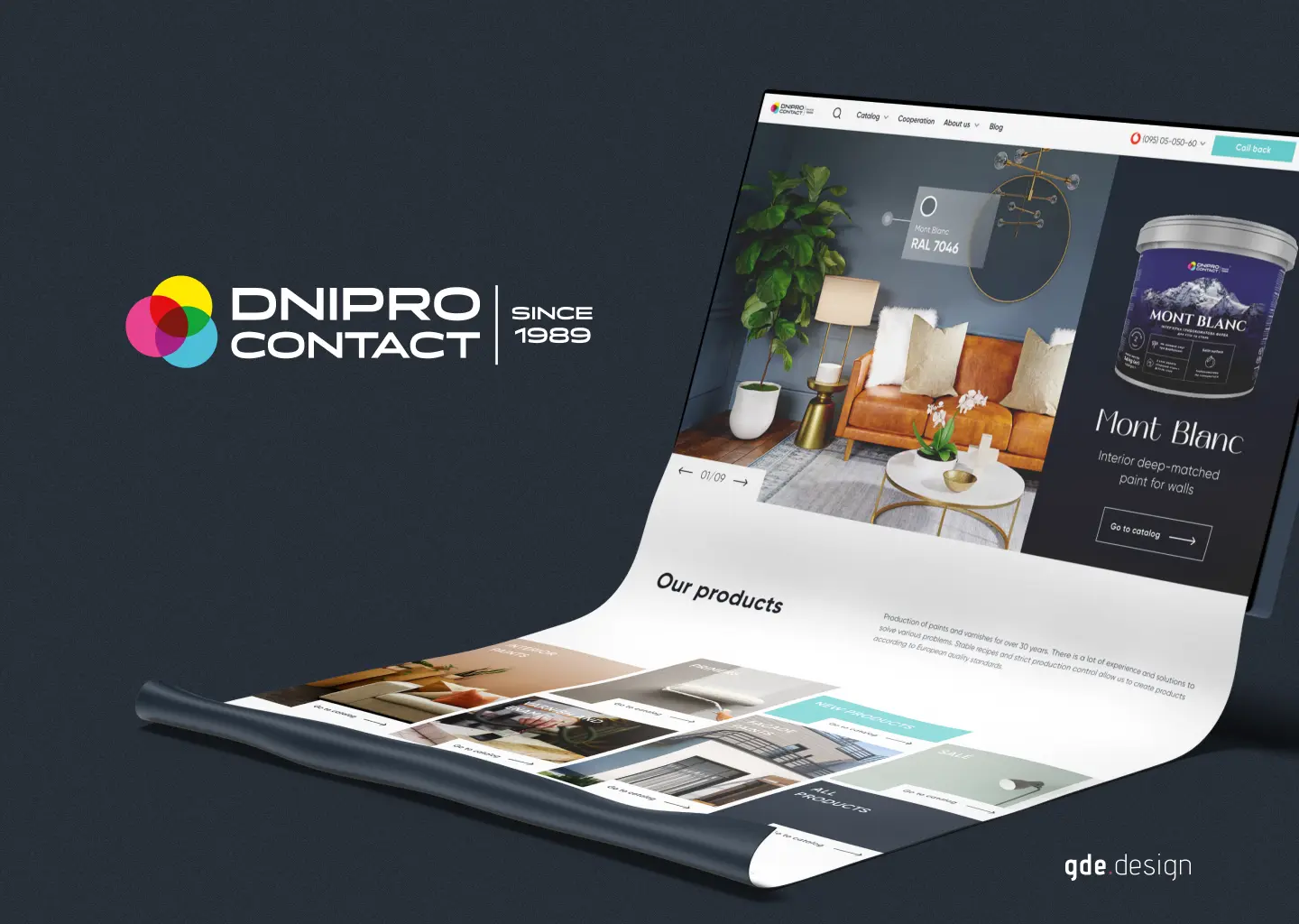
This is what we built with them: a full digital brand launch. Positioning, a new visual identity, a packaging system across more than a hundred SKUs, a product website, an e-commerce catalogue, and the SEO groundwork a manufacturer needs when it decides to stop hiding behind its distributors. Below is what the work looked like, why each layer mattered, and what any other manufacturer should take from it.
The starting point: a strong product that looked like private label
The first site visit told the whole story. Production running at full capacity. Warehouse stacked with quality product. And on the shelf at the hardware store half a kilometre away, the same product sitting in cans that could have been anybody's — inconsistent labels between product lines, no visible colour system, no typography standard, no tone of voice across the range.
This is the most common state we find manufacturers in. The product has been winning on quality and distributor relationships for years. The brand has been doing nothing. And in a market where a buyer standing in an aisle makes the decision in about three seconds, that gap costs real revenue.
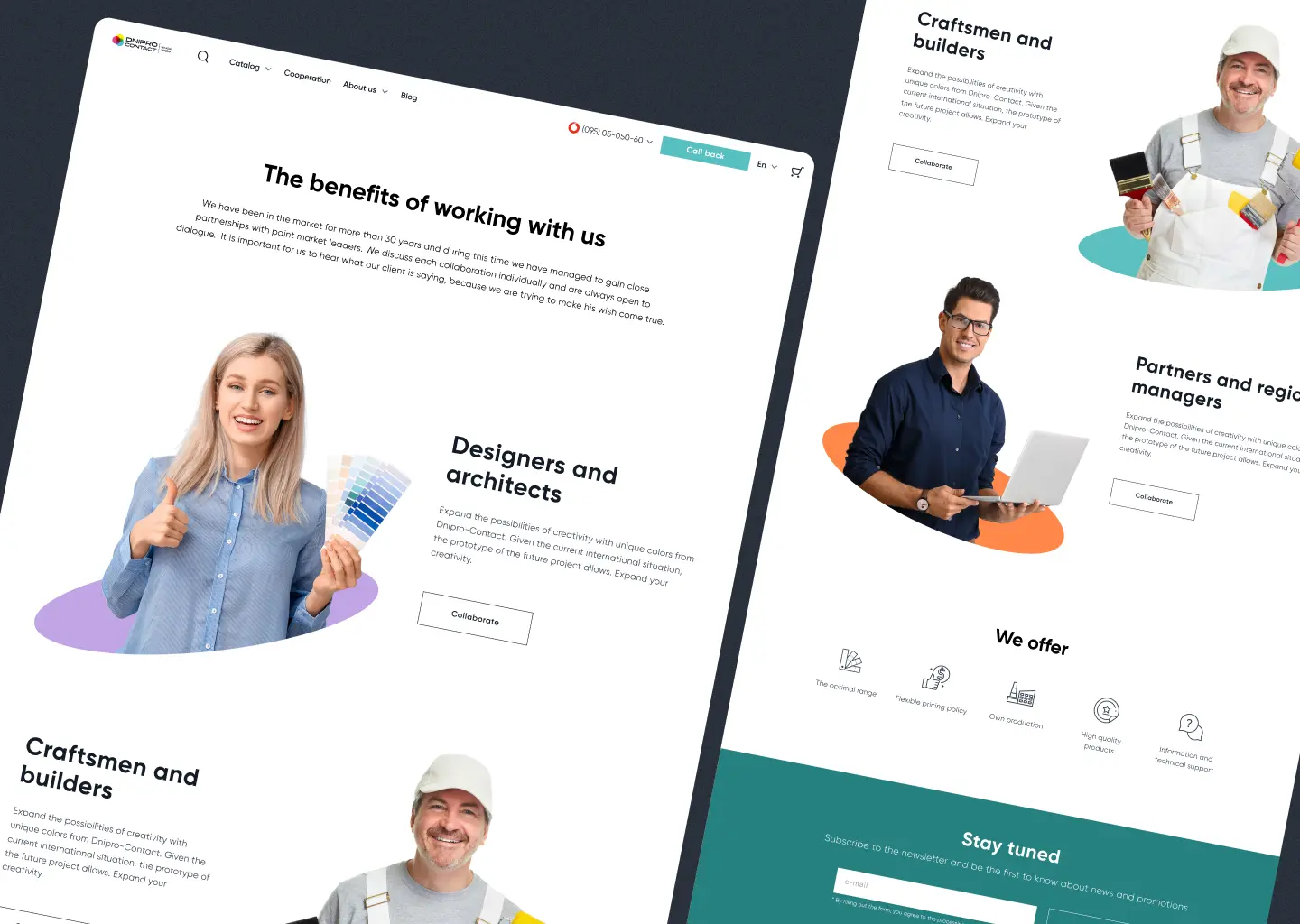
Dnipro Contact sold to two audiences that needed different things: trade professionals — painters, contractors, renovators — who cared about coverage, durability, and the price-per-litre economics of a fifteen-litre bucket; and retail DIY buyers walking into the paint aisle on a Saturday to freshen up a hallway. The same brand had to work for both, without watering down either.
What a digital brand launch for manufacturers actually covers
Manufacturers hear "brand" and think logo. Brand is five layers, and the logo is the least important one.
Layer 1 — Strategy and positioning. Before a single pixel moves, we answered: who buys this, why us over the nearest competitor, what do we refuse to be. Dnipro Contact chose "the serious Ukrainian paint for people who actually finish the job." That sentence shaped everything that came after.
Layer 2 — Visual identity. Logo, colour system, typography, and a brand book that tells a designer, a printer, and a photographer how to keep things consistent without asking. The book is not decoration. It is the document the team reaches for when a new product launches at 9pm and the packaging goes to print in the morning.
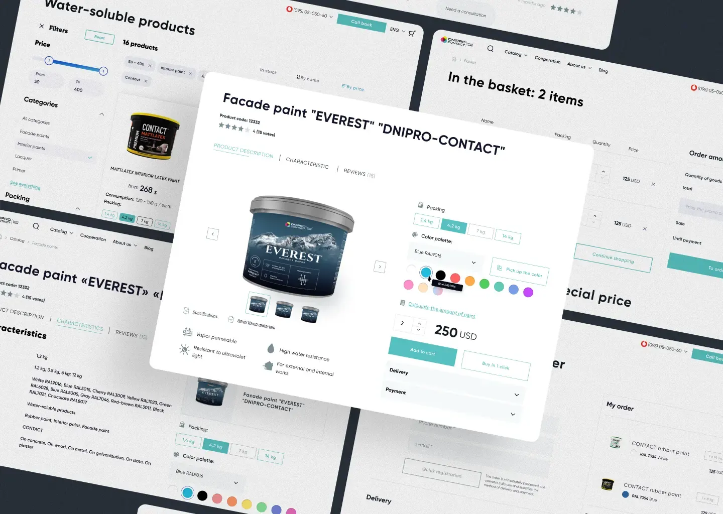
Layer 3 — Packaging design at scale. More than a hundred SKUs across interior paint, exterior coatings, primers, and specialty finishes. Every can, bottle, and bucket had to feel like a family while still telling a buyer, at a glance, whether they were holding an interior primer or an exterior topcoat.
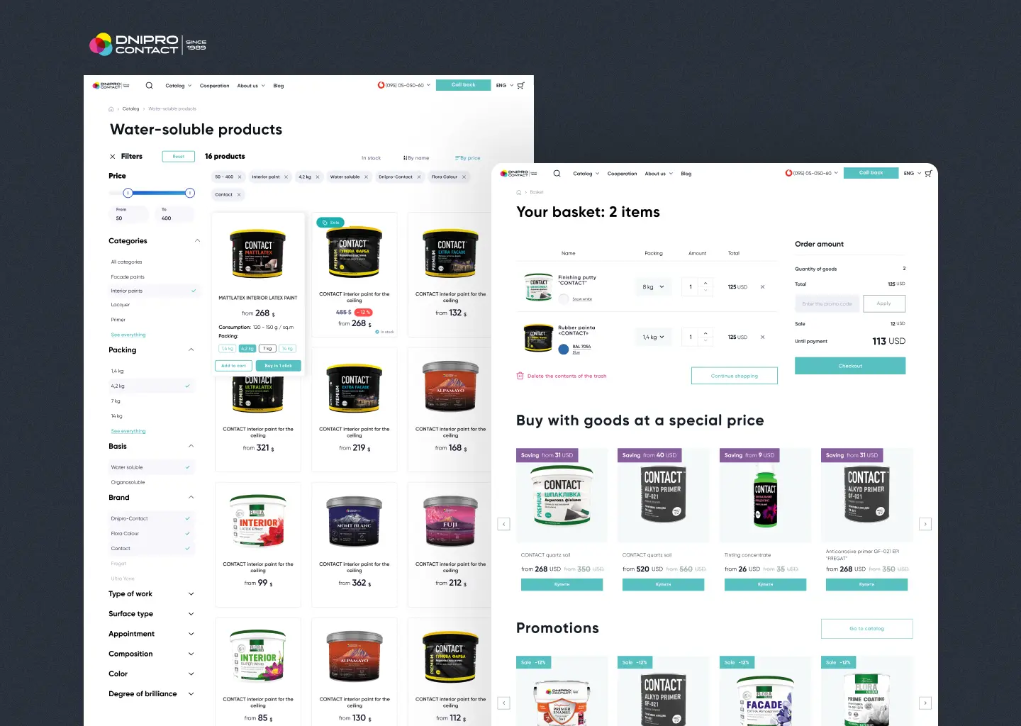
Layer 4 — Digital presence. A product site with a full catalogue, e-commerce that works for retail buyers, and a B2B-friendly product-data layer so distributors have a single source of truth.
Layer 5 — Go-to-market. Keyword research, content plan, on-page SEO, and a distribution strategy to make sure the brand actually reaches the people who are already searching for "washable interior paint" and "exterior facade paint for winter application."
Skip any one of these and the brand leaks at that seam. Most agencies stop at layer two and call it a job. Manufacturers need all five.
Phase one: discovery and positioning
Before any design started, we ran two weeks of discovery. Competitor teardown across Ukrainian and imported paint brands. Interviews with ten of their trade customers and five retail distributors. A positioning workshop with the Dnipro Contact leadership. The output was a one-page brand architecture: a master brand, sub-families for the main product lines, a tone of voice that balanced professional authority with retail accessibility, and a clear rule for what the brand would never be (cheap-looking, generic, or "just another can").
Two pieces of that research shaped every downstream decision. First, trade buyers trusted Dnipro Contact's thirty-five-year track record but had never seen it communicated — the heritage was an asset the brand was failing to use. Second, retail buyers actively looked for Ukrainian-made alternatives to imported European paint. The brand had both signals but neither was visible on the shelf.
Phase two: visual identity
The identity brief was straightforward: durability, precision, Ukrainian manufacturing heritage. No paint brand in the category was leaning into heritage. Most were chasing a generic "modern" look. Dnipro Contact had a real story and an obvious opening.
The logo, colour system, and typography were designed to survive two very different constraints. A small retail label needs legibility at 60mm wide in fluorescent store lighting. A fifteen-litre trade bucket needs a graphic system that reads from across a warehouse. Both had to work. Every CMYK value was tested against the two printers the factory actually uses, so nothing on the brand book was theoretical. If it looked good on a metallic can and on a matte paper label, it shipped. If it didn't, it went back.
Phase three: packaging across 100+ SKUs
This was the biggest single slice of the project and the one most agencies underestimate. A hundred SKUs is not "one packaging design times a hundred." It is a system problem. Design each can in isolation and by SKU forty you have visual drift, by SKU eighty you have a fragmented shelf, and by SKU one-twenty you are redesigning the earliest ones.
We built a modular architecture instead. One master grid. One typographic hierarchy. Four product-family colour anchors — interior, exterior, primer, specialty — with a rule for how sub-variants inside each family differentiate without breaking the family. Any new SKU slots in: the designer picks the family, sets the variant, and the system does the rest.
Three non-negotiables guided every decision.
Consistency. A buyer walking the paint aisle sees the full range as one brand, not twenty small ones. Even without knowing the product names, they recognise a Dnipro Contact can from three metres away.
Differentiation. Inside that consistent system, each product line has its own visible identity. An interior paint can does not look like an exterior primer. A specialty finish does not look like a base coat. Buyers find what they need without reading every label.
Production readiness. Every delivered file is something the factory's print partner can run. Die-cut outlines for non-standard formats. CMYK and Pantone specs. 3D renders for sales presentations and distributor pitches. Barcodes and regulatory copy placed where they belong. No "it looks great in Figma but breaks on press" surprises.
Got a SKU catalogue that's drifting?
We design modular packaging systems for manufacturers with complex product lines — so the hundredth SKU looks like it belongs with the first.
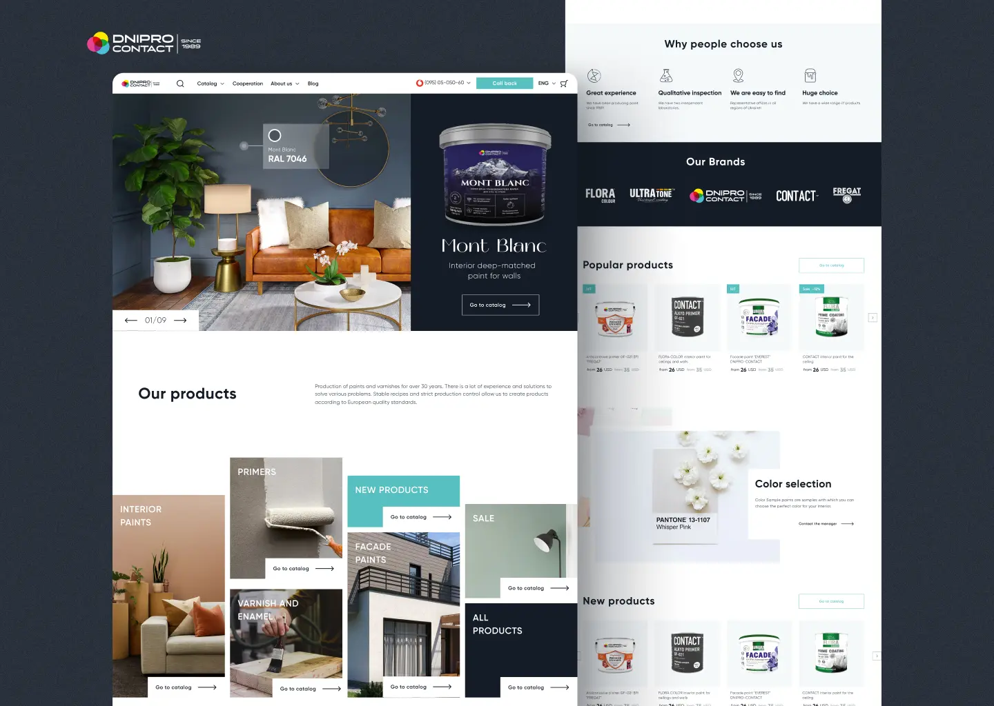
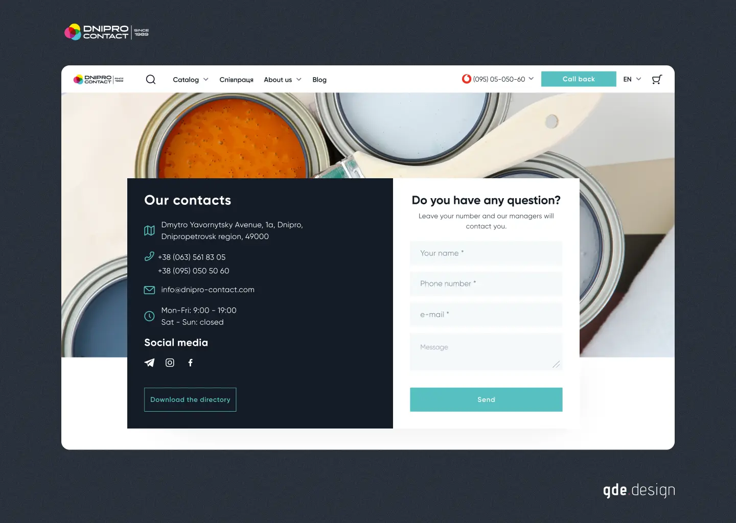
Phase four: the digital home
With identity and packaging in place, we shipped the digital infrastructure. A full e-commerce catalogue, a product site built to serve both retail buyers and trade accounts, and SEO-optimised product pages tuned to the searches their buyers actually run.
The catalogue is the part most paint manufacturer websites get wrong. Buyers do not shop by SKU. They shop by job: "interior paint for a nursery," "exterior facade paint that survives a Ukrainian winter," "primer for a drywall patch job." The site's taxonomy mirrored those jobs, not the factory's production taxonomy. Every product page answered the four questions buyers ask out loud when they are holding a can in a store — coverage, drying time, application surfaces, and price per square metre — before the fold, without a scroll.
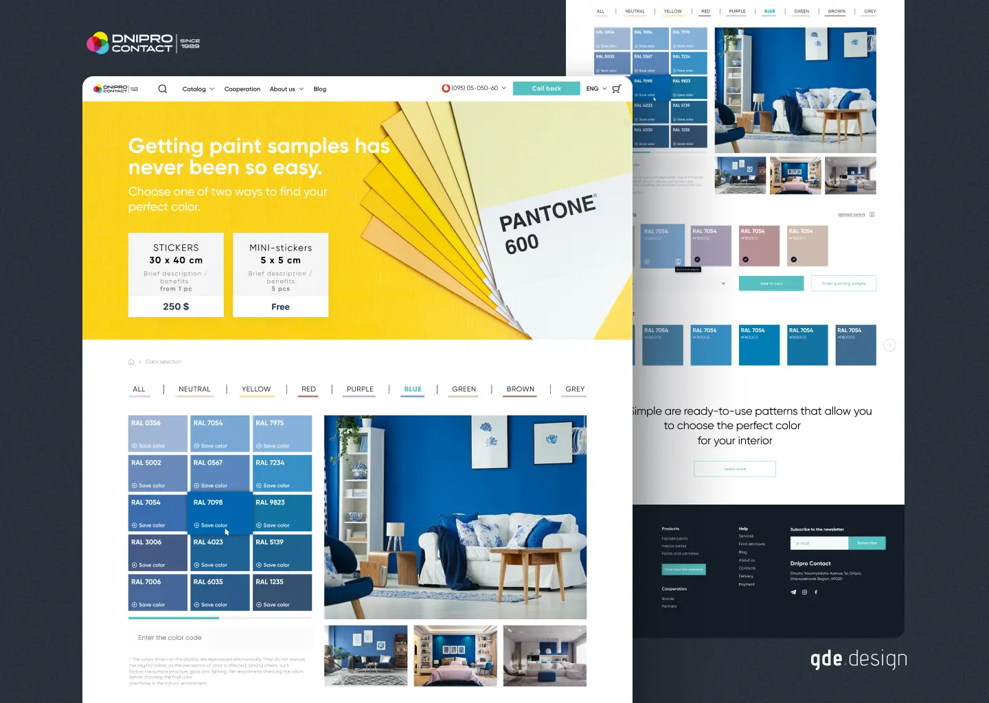
Two decisions mattered most to conversion. First, colour tools. A paint buyer who can see the product on a wall, in a room like theirs, converts at a different rate than one looking at a swatch. We built interactive colour preview and a simple calculator that tells a buyer how many litres they need for the room they are painting. Second, trust signals surfaced where buyers make the decision: factory photography, the "since 1989" mark on every product page, certifications visible in the product header rather than buried in a separate "About" tab.
Phase five: marketing, SEO, and GEO
A brand that nobody finds is still invisible. Once the site was live we built the content and SEO strategy from scratch. Keyword research on the actual search intent — "washable interior paint," "exterior paint for wood," "quick-drying primer" — and a content calendar that covered each product category with a real answer, not a thin listicle. On-page optimisation from the URL structure up: product category pages, product pages, and a growing knowledge base that earns links because it is useful.
GEO — generative engine optimisation — mattered earlier than we expected. Buyers use AI assistants to research paint before they buy, especially in the retail segment. The structured product data we built for the catalogue feeds directly into how AI tools summarise the brand when a shopper asks them for a recommendation. Specifications, lightfastness, coverage rates, and surface compatibility: written in plain language, marked up in structured data, picked up by the models.
What changed
Dnipro Contact went from a production company with a shelf presence problem to a branded manufacturer whose identity holds together across every surface: packaging, product pages, sales decks, retail displays, and distributor materials. The packaging system was delivered in phases — hero SKUs first, rolling schedule for the remaining lines. The new identity gave the team a foundation that keeps working as the catalogue grows.
The digital presence opened a direct retail channel the company never had. Trade buyers now send distributors to a single product page instead of a PDF from 2014. Retail shoppers find the brand on their own search terms and buy without needing a sales rep in the loop. The factory kept doing what it did well for thirty-five years; the brand finally caught up.
What this means for other manufacturers
If the product is good but the brand is not telling that story, money is leaking at every point of contact. Retail listings where buyers choose the one with the more confident label. Distributor negotiations where your case has to come entirely from the sales rep because the packaging is not helping. Direct-to-consumer sales that never happen because there is no website to send a buyer to.
A digital brand launch is not a one-time design project. It is a strategic investment in how every future product is perceived — and in an industry where a buyer's first encounter with your product is a can on a shelf or a thumbnail in a search result, that perception is most of the sale.
A realistic timeline for a project on Dnipro Contact's scale is 12 to 16 weeks from discovery to production-ready delivery. A smaller catalogue with fewer SKUs runs shorter. A project that includes a full e-commerce build and a go-to-market engine runs the full 16 to 18.
FAQ
What is a digital brand launch for manufacturers?
The process of building or overhauling a manufacturer's full brand presence: positioning, visual identity, packaging design for every SKU, a product website, and a go-to-market motion. The point is to let the company compete on story and shelf presence, not just price and distribution.
How long does a manufacturer brand launch take?
A full launch runs 12 to 18 weeks. A project with 100-plus SKUs, a complete e-commerce build, and a content engine lands at the upper end of that range. Phased delivery is common — brand and hero packaging first, then remaining SKUs on a rolling schedule.
What is the difference between branding and packaging design?
Branding is the strategic layer: positioning, tone, logo, colour system, typography. Packaging design applies that brand to physical formats — cans, bottles, boxes, labels — with die-cut files, correct colour profiles, and print-ready specs. You need both, in that order.
Can Cinnaboner handle packaging for manufacturers with large SKU counts?
Yes. Dnipro Contact had over 100 SKUs across interior, exterior, primer, and specialty lines. We use modular packaging systems that share a master grid and typography so new products slot in without a redesign.
What does a manufacturer brand launch cost?
Cost tracks scope. SKU count, whether a site build is included, and depth of go-to-market strategy are the three biggest levers. We scope a quote after one discovery call — no proposal templates, no ranges we pulled from a website.
Related reading
Dig deeper into manufacturer branding and packaging on the blog and the service page.
How to Brand a Physical Product for E-Commerce: From Factory to First Sale covers the full five-step brand build from positioning to launch. The Digital Presence Check for Manufacturers is the audit framework we use on every manufacturer engagement. And Cinnaboner for Manufacturers is the full service overview with the Dnipro Contact case study in context.
Is your brand ready to launch?
If you're a manufacturer with a good product and a shelf presence problem, book a discovery call or request a quote. We'll scope the work and tell you honestly what 12 to 18 weeks of a brand launch would look like for your catalogue.